✺ Case study — 04
presenting
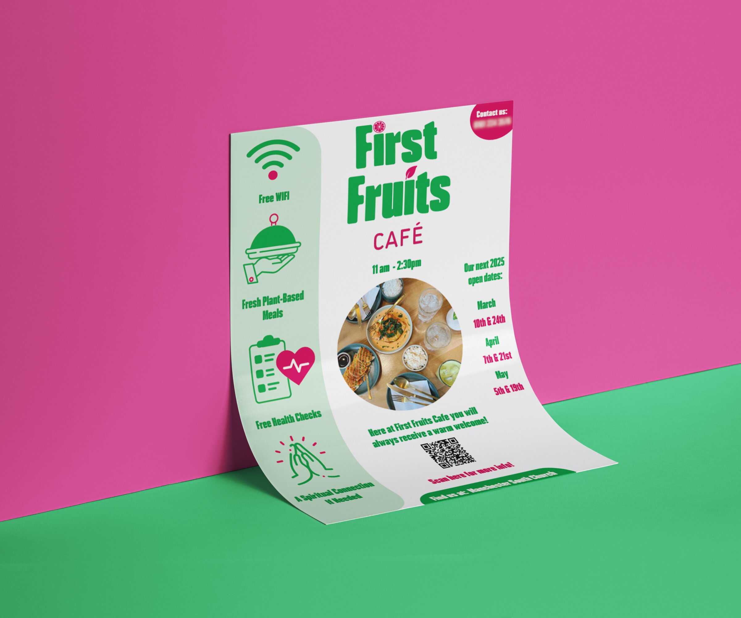
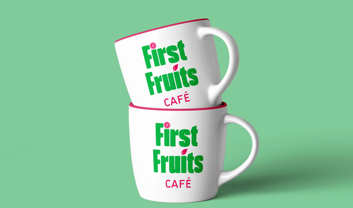
First Fruits Café.
RoleBrand Identity & Print Media
ClientCommunity café, Manchester
ToolsAdobe Illustrator
✺ The shape of it
Long story short.
The whole story in three beats — the spark, the thinking, the result.
01Brief
Earn trust on a tight budget.
A community café needed a brand that signalled care, health and welcome to a diverse local audience — with no existing visual presence to build on.
02Approach
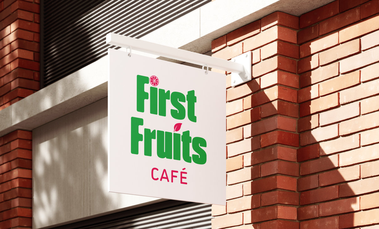
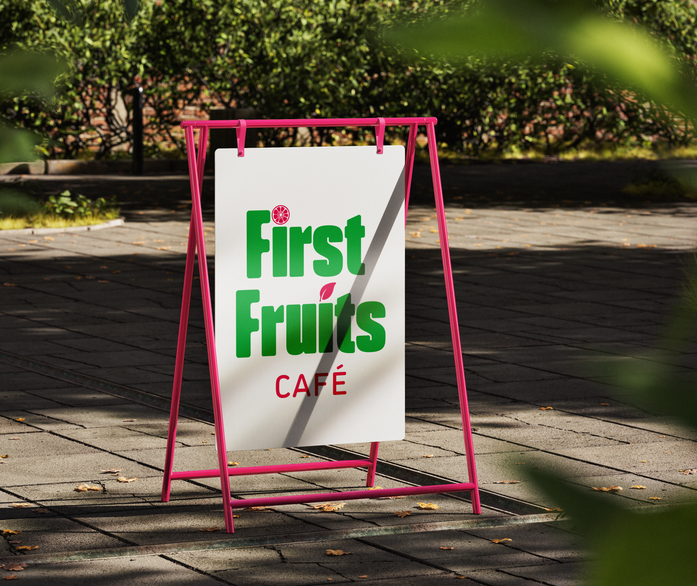
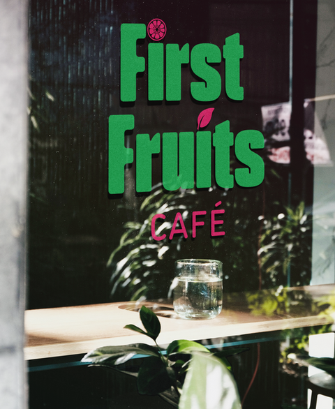
Strategy in every colour.
Greens for health, magenta for warmth, a custom illustration for instant recognition. Every choice made to communicate the mission, not decorate it.
03Deliverables
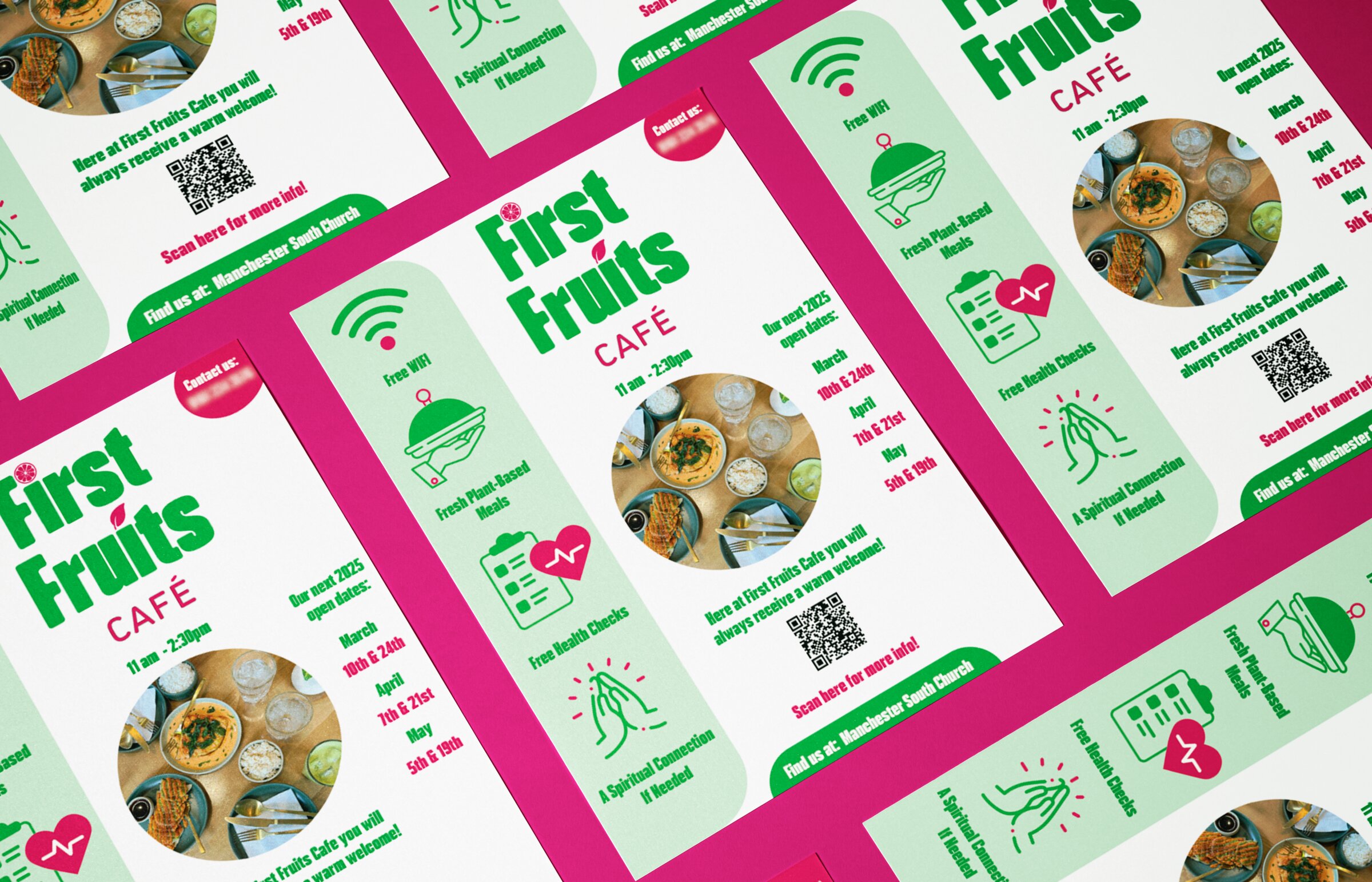
A grassroots brand that punches up.
A complete identity and printed leaflet system that gave the café a clear, consistent voice in the community. Distributed to 3,000 local residents, contributing to a 10% bi-weekly increase in café attendance.
✺ The work
Built to be seen.
next up —
More Than Drill & Drum
Brand Identity / Visual System
View case study →