next up —
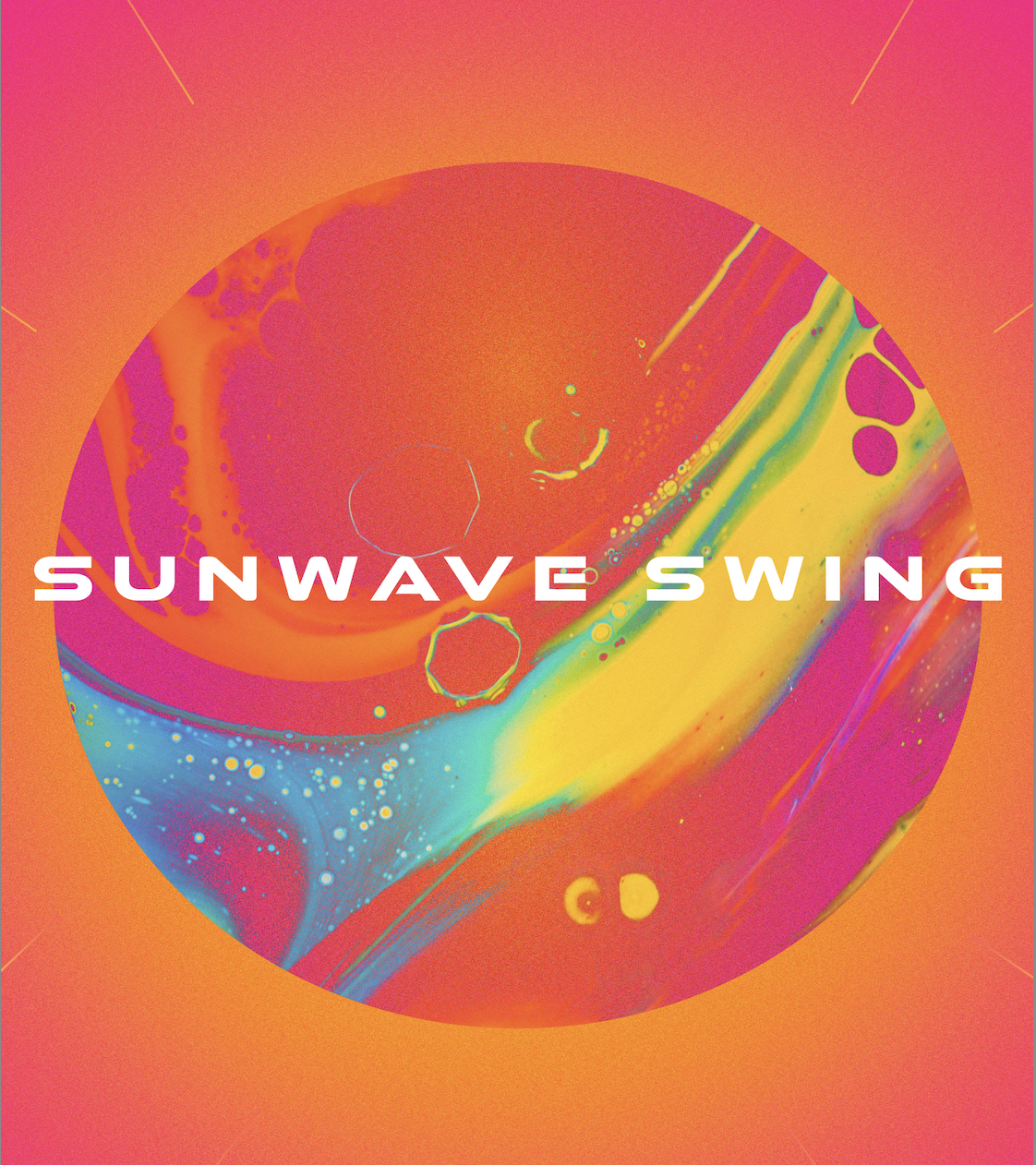
Sunwave Swing
Music Festival Campaign / Social / Visual Identity
Coming soon — watch this space✺ Case study — 05
presenting
✺ The shape of it
The whole story in three beats — the spark, the thinking, the result.
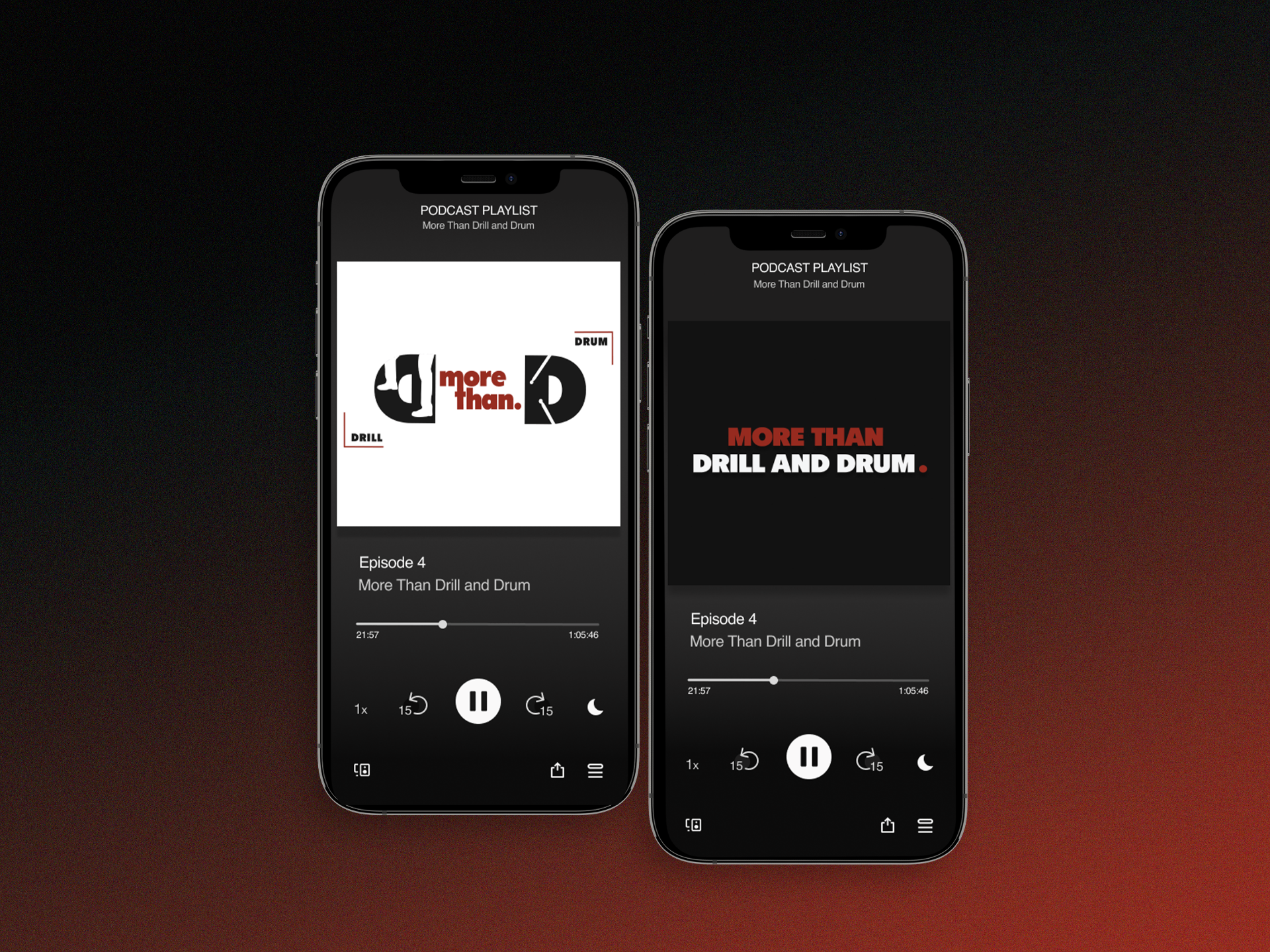
MTDD needed a brand that captured drill and drum culture honestly and flexible enough to live across podcast art, social and merch.
Fused illustration and typography into a logo that feels hand-built and culturally specific, then built a motif system that scales from avatar to banner.
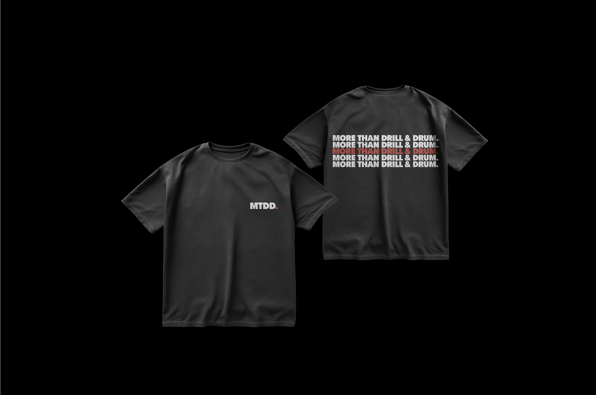
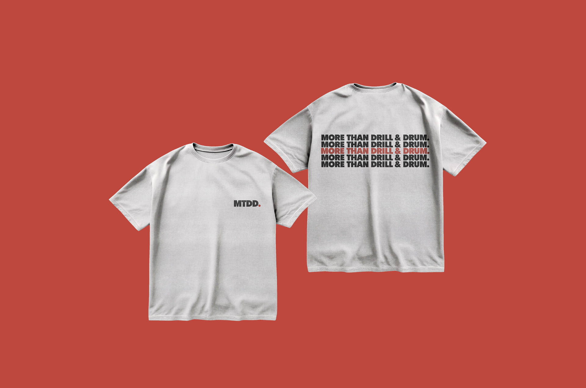
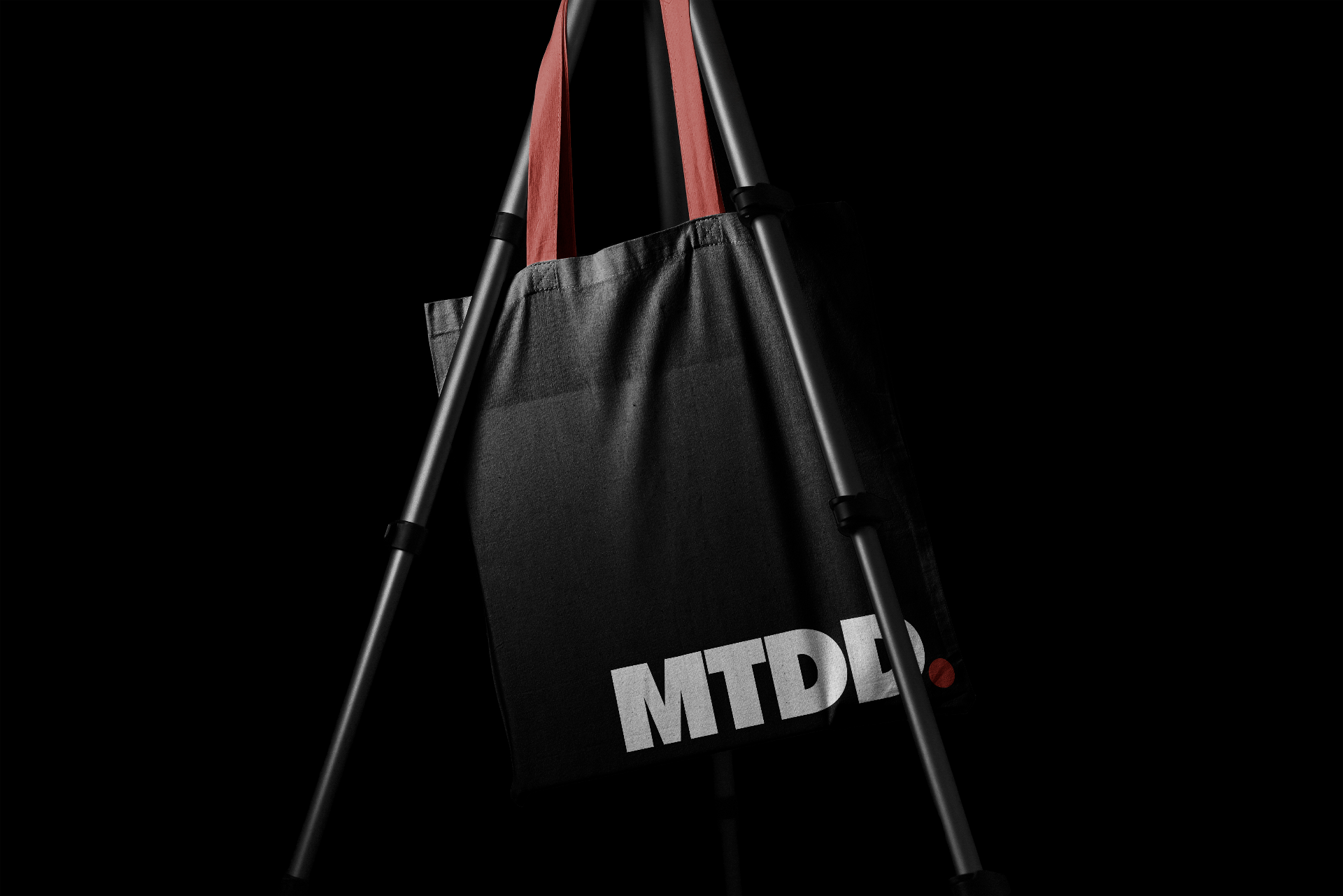
A brand language the client can extend — logo, motif and visual system ready for everything that follows.
✺ The moodboard
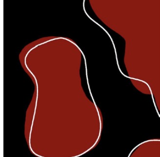
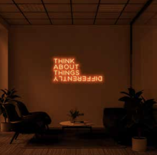
The visual language behind the brand — type, light, shadow, motif and material, mapped before a single logo was drawn.
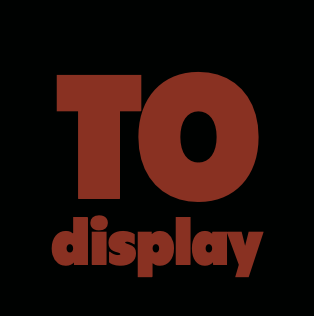
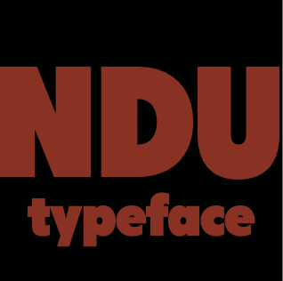
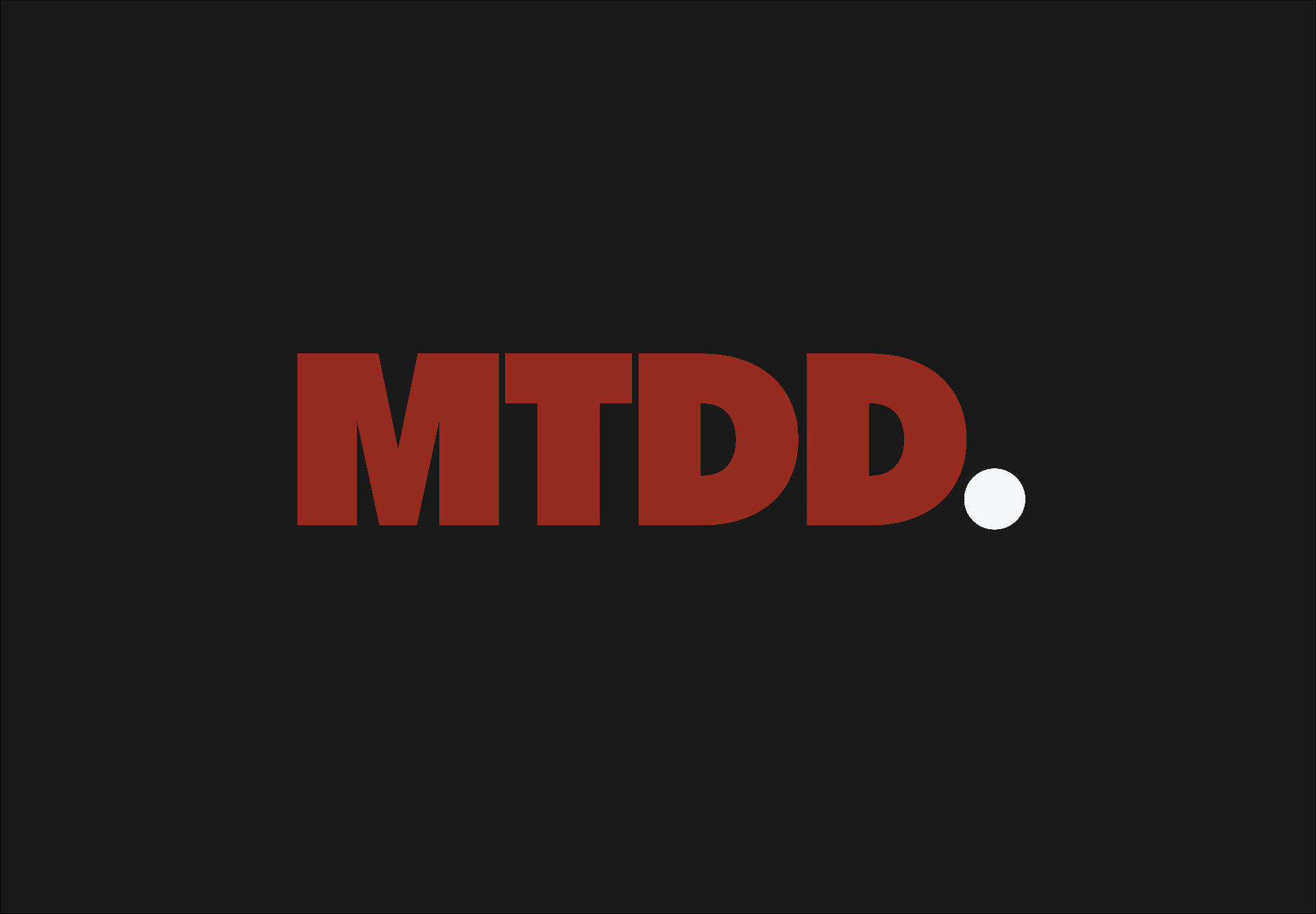
TONDU display typeface sets the bold, cultural tone of the brand's voice
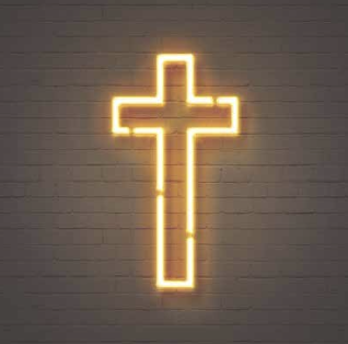
A cross to anchor the brand, a nod to the brand's faith roots.
Colour scheme: red, black & white used together and interchangeably throughout logo and motif for various colourways.
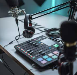
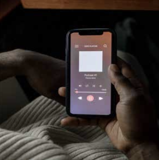
To be listened to and seen.
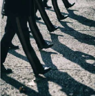
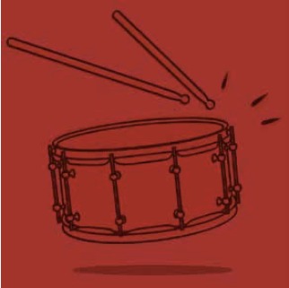
Marching and a drum reference to the brand name and identity.
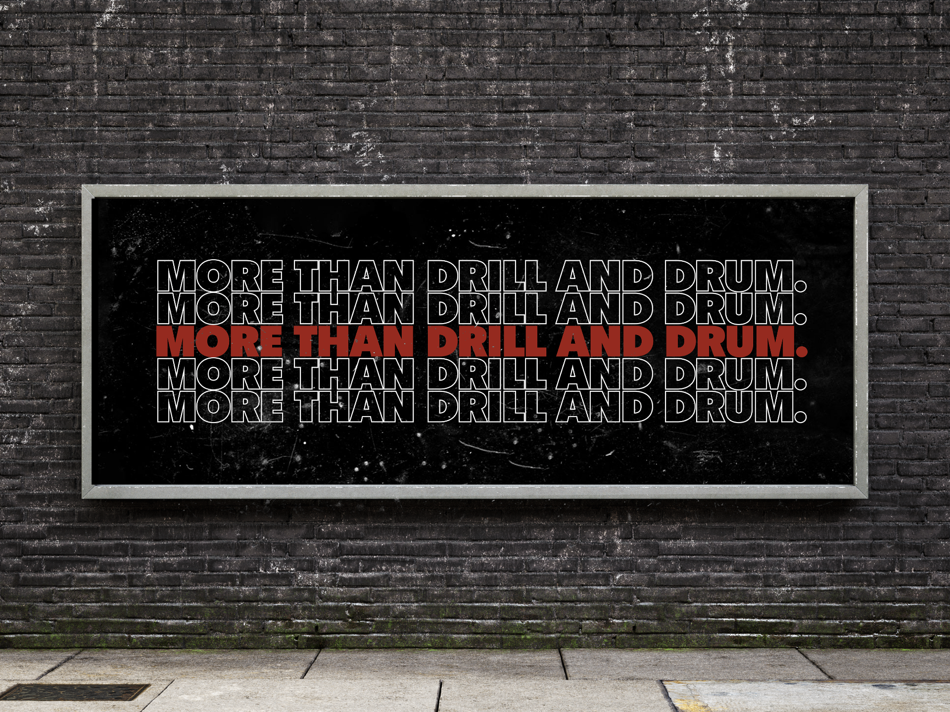
The brand's underlying message to think beyond the genre.
✺ The logo
✺ The work
next up —
Music Festival Campaign / Social / Visual Identity
Coming soon — watch this space