✺ Case study — 01
presenting
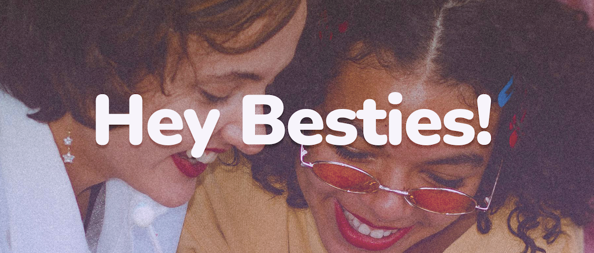
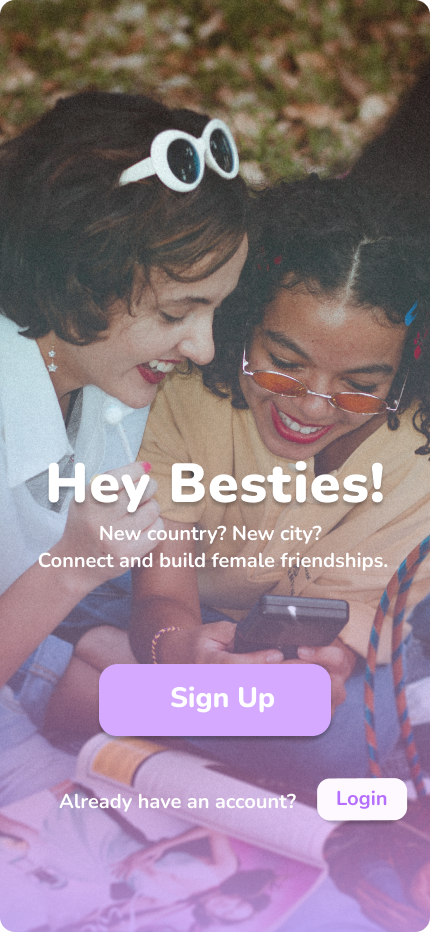
Hey Besties!.
✺ The shape of it
Long story short.
The whole story in three beats — the spark, the thinking, the result.
Insight before aesthetic.
Designed a brand and app concept around a real, audience-led pattern. Turning an insight into a product that solves a real social and communal need.
Brand as belonging.
Colour, tone and imagery all signal one thing: this space is for you. Purple over pink to feel inclusive, not stereotypical, and onboarding built around a deliberate range of women. The audience sees themselves before they see the product.
Marketing starts before the campaign.
A concept that shows how brand identity functions as a community-building tool, earning trust from the first screen to the street.
✺ The screens
Designed with intent.
A walk-through of the key screens — and the thinking baked into each one.
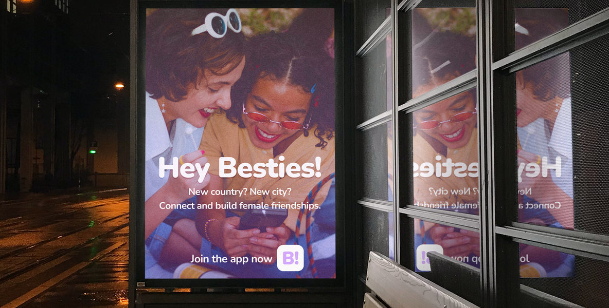
Purple gradient overlay on the photo which creates a retro effect. Font used: Nunito
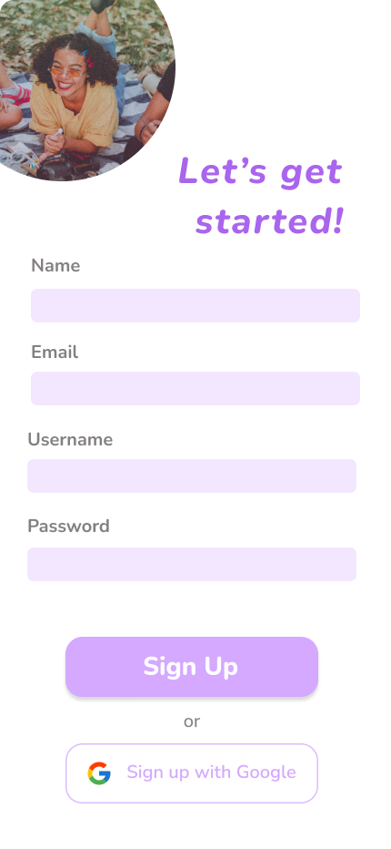
Two sign up options to provide an easy and simple user experience
Home screen showing what matters most: upcoming plans, new connections, nearby activity
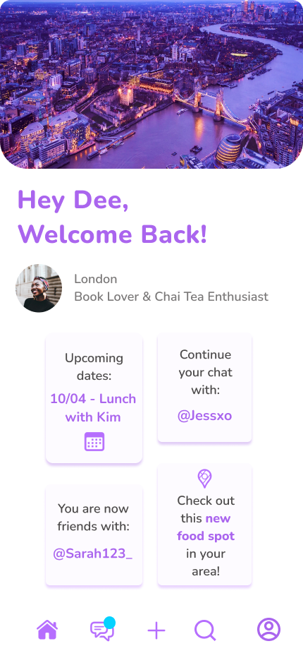
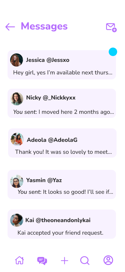
Friends, connections and users within the app ecosystem and Hey Besties! community
✺ The work
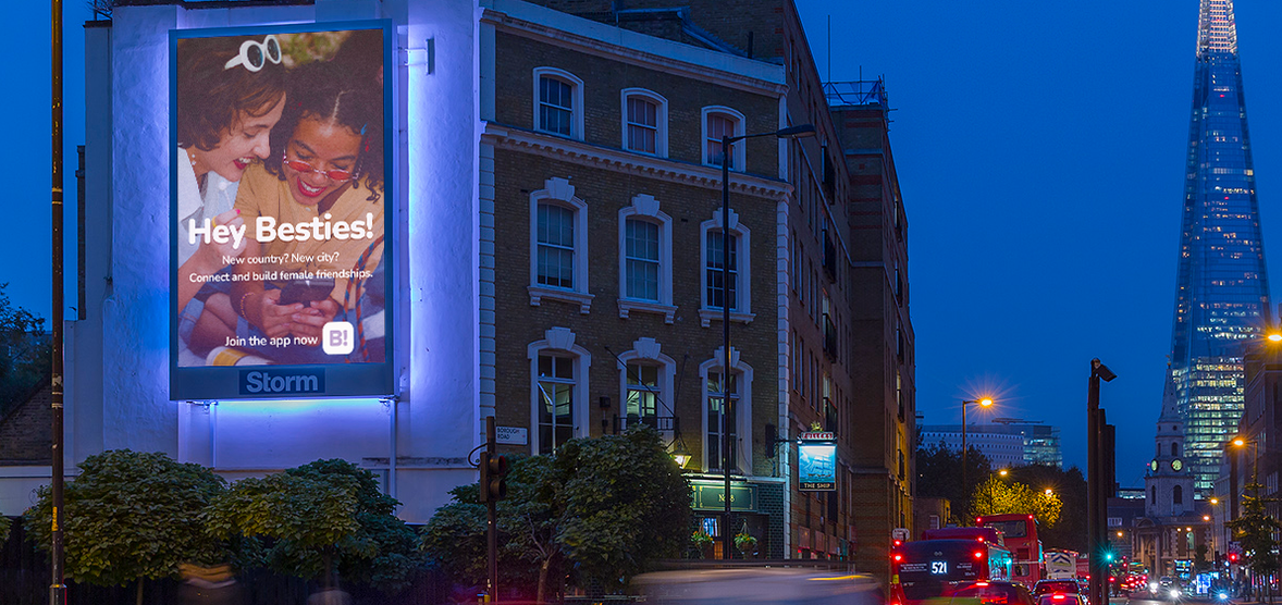
From Screen to Street.
next up —
Winter Break Campaign
Campaign Strategy / Content Storyboard
View case study →